Indre Kisonas
We walk through a field of colour experiences from the moment we wake up. It could be the brilliant gold of the sunshine through the crack in the window blind that wakes you up. It is a direct signal to the brain to rise and shine, as is the colour of your sheets as you peel them back.
The wall colour as you move through the house and then, what will you wear? The colours you put on will be a reflection of the mood you are in, or a reflection of the day you perceive.
Often, I put on pink first thing, to nurture and be kind to myself. Pink is a colour of self-love. A colour of kindness and loving. I do this consciously, as well as unconsciously, as I am very aware of the colours in my life. It interests me to notice what colour coffee cup I or my family members choose. Which coloured shirt they need for the day. I say need, as colour has a vibration that has been scientifically proven to affect our brainwaves, body and mood.
Colour psychology along with consumerism and buying habits is big business. We know fast food chains use yellow and reds to get noticed quickly, entice but then move customers on. Blue is respected and loyal. A surety, as in blue chip investments or bank logos. Wear it when you go for a job interview. Green is calming and soothing. We go to the park or sit under a tree for peace. White being purity, cleanliness or freshness, is the doctors medical coat or the clinic’s décor.
Using colour is the fastest way to change a mood or perception. It is the first thing your brain notices. Ever wondered why relaxed clothing, such as tracky daks or hoodies come mostly in grey? It is used for switching us into neutral and we put them on when we are slouching, relaxing and blending in.
The same ideology applies to home or office décor with fashionable colours reflecting not only us individually but as a collective. Worldwide events affect us which in turn affects how we manage our stress and environment. Colour palettes are forecast early by invested industry bodies and they reflect us communally. Paint colours, clothing colours and home wear are influenced by these forecasts and consequently, we are all affected by this.
My colour forecast for 2024 is split into two palettes. Soothe and embolden.
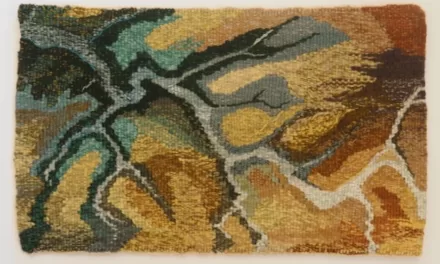
The first palette is soothing due to turbulent worldwide fighting, lockdowns, raised living costs and raised emotive responses. I give you images from nature to demonstrate these colours as nature in her wisdom, always knows best. Soft green, soft chambray blue with soft pink and soft white. Perhaps a smidge of soft yellow or orange. Soft, gentle and nurturing. To keep the adrenaline and cortisol levels calm.
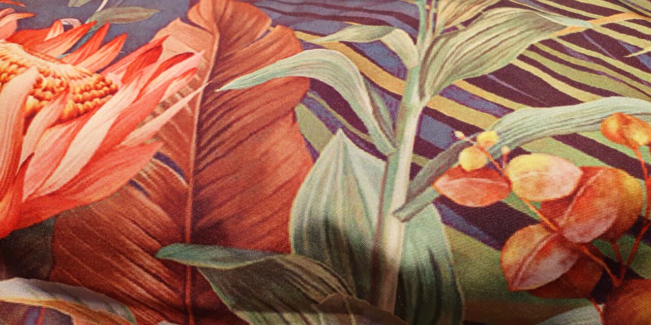
The second palette is bolder. We are using brass and gentle metallics in décor, along with dark blue instead of grey. We are a tad tired of the grey upon grey. Add dark orange or rusty earthy reds or a hint of cheerful yellow to brighten things up. This palette is for those wanting some cheer and grounded optimism.
Staying mindful of the colours you surround yourself and family with will affect your wellbeing.
Indre Kisonas is a Daylesford resident and the owner and principal designer of iok design. She specialises in colour & interior design.
indre@iokdesign.com.au